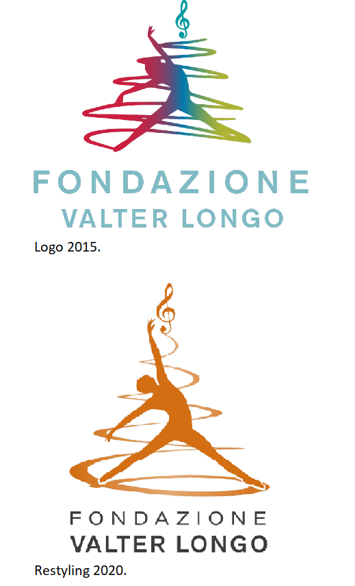
Founded by Professor Valter Longo, the history of the Foundation begins in 2015 in Los Angeles, California (USA) and the Foundation’s logo expresses the possibility of giving space to creativity and science in a more equitable world for all in which everyone, independently from their economic, social or psychophysical conditions, may have the opportunity to access treatment and have a long and healthy life.
The logo of the Foundation in its first multicolor version, represented a dancing silhouette that with the hand rises towards the treble clef in a path of discovery and passion for the future and science, where music and dance symbolize art as an expression of creativity.
The next version dates back to 2020 and is the first restyling of the logo, a restyling that aims to simplify and update. The Foundation’s logo restyling project stems from the desire to give more strength and recognition to its message of “creativity in science and medicine to facilitate the treatment of the most common diseases and the longevity of the person”. The treble clef, symbol of creativity, the spiral of movement and the silhouette of well-being are now more recognizable. Furthermore, the spiral is connected to the treble clef as if to indicate a connection between the earth, the person and creativity. The logo consists of the orange pictogram and the cool gray logotype.
Il restyling del logo di Fondazione Valter Longo Onlus è una preziosa donazione da parte di Tiziana Perotti, consulente di comunicazione e digital marketing e Riccardo Gianangeli, art director.